There's no denying that catalog marketing has many advantages. And it's no secret that a well-designed catalog will help your business succeed.
From increased brand visibility to increased sales and every catalog benefit in between, follow these catalog design tips to generate maximum results.
Even if it's your first time designing a catalog, don't worry. These design tips are simple, and we've included easy-to-use templates to help you create a stunning catalog.
Catalog Design Tips
1. Identify Who You Want to Target
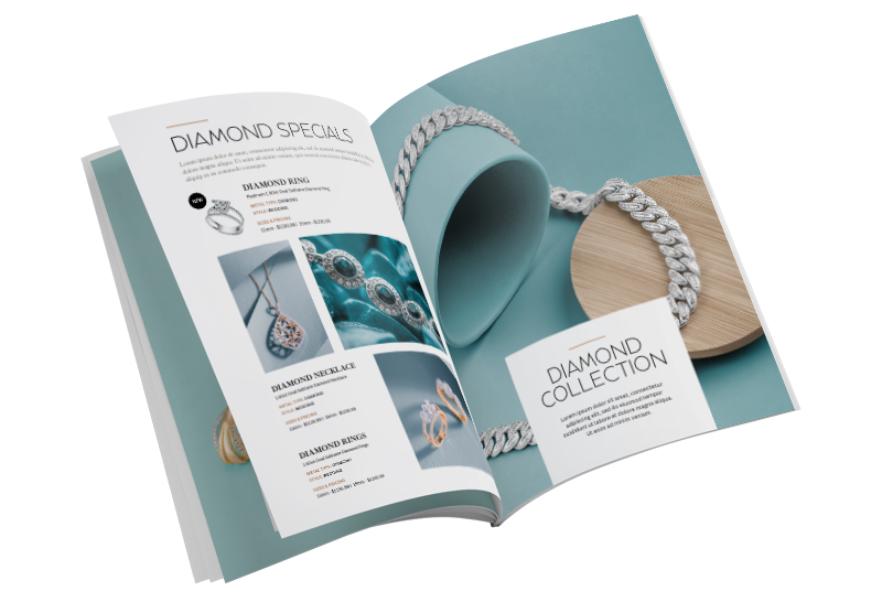
You want to design for your specific customers and potential ones.
For example, if your target audience is younger, a modern layout, sharp design, social media links, hashtags, and images they can relate to will help your readers connect more to your catalog.
Knowing your audience is essential, and when it comes to designing your catalog, you must choose the right tone, font, images, catalog layout, colors, and more that communicate to your audience to draw them in.
2. Outline the Contents of Your Catalog
Whether you're designing a product catalog, an informational catalog, or another type of catalog, you need to plan and gather your content and outline the layout, including your cover, introduction page, product pages, and so on. Determine what products you want to list, what information and topics you want to share, and what types of images you will need.
This will help you to choose the right size and page count depending on how much information you need to include within your design.
3. Limit Your Typefaces

Too many fonts will create confusion. Limit your fonts to 1-2 families, and that's it. You want to choose a font that represents your brand and is easy for your audience to read.
For example, if your website uses Ubuntu for its text, use Ubuntu for your catalog font. You can use bolds or italics to change things up for headers or special text without choosing a different typeface.
4. Limit Your Copy
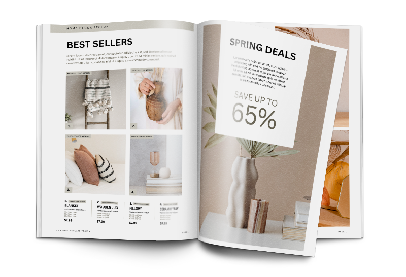
Keep your copy concise. Even if you're designing an informational catalog, you're not creating a novel. You want a good image-to-copy ratio, so use your images and design elements to help guide you in choosing only the copy or details that matter most.
5. Make Your Headings & Subheadings Count

Your heading should draw your audience in. For example, keep the headline on your cover short and bold. You want it to give a sense of urgency and intrigue your readers to open your catalog to learn more.
The headers within your catalog pages should do the same while acting as guides to help your readers understand each page or section. For example, if your catalog features your beauty products, organize your contents within your product catalog design and include a header for each category of products like your cosmetics and bath and body items.
6. Choose the Perfect Images
Choose imagery that reflects who your audience is, your offerings, and your brand identity.
If you're listing products, your catalog design should include images of your products, or if your nonprofit is promoting an event, include images that reflect your organization's mission. In addition, your pictures should align with the specific demographic you're targeting.
7. Don’t Ignore Image Quality
Many people scan through catalogs just to look at the images and see if anything catches their eye.
Quality and well-photographed images aren't something to skimp on if you're designing your catalog on a budget.

There are great websites where you can download high-resolution images for free, like Unsplash and Pexels. However, if you need photos of your products or pictures related to your brand, then it's best to invest in a photographer who will help capture beautiful images as they will help build trust and better brand recognition, attention, and interest.
When adding your images to your design layout, ensure that your images are at least 300 dpi in resolution to avoid fuzzy photos.
8. Choose the Right Colors
The colors you choose for your catalog design should align with your brand colors and match the tone and theme of your catalog message. For example, neutral colors are great for an outdoors catalog, while statement colors like bright reds and deep purples are perfect for a fashion catalog.
Make sure to keep dark fonts on light backgrounds and light fonts on dark backgrounds so words are easy to read. A neon yellow headline on a white background will be hard to read, while a yellow headline on a black background will be bold and clear.
9. Pick the Right Size & Orientation

Depending on your budget and the content you wish to include in your catalog design, you need to choose the right size for your goals.
Larger catalogs, like 8.5 x 11 or 9 x 12, are ideal if your catalog design includes many images and details. They are also suitable for mailing as they stand out more. A 5.5 x 8.5 or 6 x 9 catalog is great for simpler catalogs that are light in text or for handing out at a trade show or event, as they are easier to carry around.
Catalog designs are also typically printed and bound in portrait format, which is beneficial for displaying on bookshelves or magazine racks. However, if you want to get creative, consider designing your catalog in landscape format.
10. Always Use a Catalog Design Template
Designing a catalog can be tricky, but it's easy with a catalog design template.
Your printer should have multiple catalog templates to fit whatever size and orientation you wish to print your catalog. These templates have guides to ensure your catalog design has the proper bleed and margin required to print at the highest quality.
Check out our catalog design templates below:
11. Get Creative with Design Elements
Use design elements like shapes or patterns to add creative style to your catalog design.
Borders around images, text, and graphics that flow from one page to the next and lead the eye to certain elements or patterns that spread across the catalog pages are all great ways to keep your design unique and fresh.
12. Use Negative Space to Your Advantage

Negative or white space helps break up your content. It prevents your catalog design from coming off as cluttered or overwhelming.
Use white space when laying out text, images, and graphics on each page to ensure each design element isn't too close together. There should be enough negative space to let your readers rest their eyes and comprehend the information better.
13. Keep Your Catalog Layout Fluid
Each page within your custom catalog must seamlessly flow together from the front to the back cover. This includes the theme, design, and tone. Your catalog is one tool; its contents should work together to deliver your overall message.
This goes for the items you showcase as well. Suppose you are listing every product you have for sale. In that case, similar products should be grouped. Don't scatter your apparel products with your home goods.
14. Don’t Forget Your Brand
Your catalog needs to relate to your business, and your readers need to know who your catalog came from.
One of the most essential and easy catalog design tips is to include your logo, contact information, company tagline, and other brand identifiers throughout your entire catalog design.
15. Highlight Your Most Profitable Items

What sells the most? What makes your company the most money? What will your audience receiving your catalog enjoy or need the most?
Highlight these items with images, larger text, borders, or shapes. You can even use an entire page to highlight one of your most profitable products or services. Some marketers use the first few pages in their catalog to showcase a handful of their most popular items and the corresponding page number so readers can navigate to the complete product listing easily.
16. Use Page Numbers
Use page numbers that your table of contents references to make navigating your catalog easy. By including numbers on your catalog pages, your readers can quickly flip to the product or other content that most interest them.
17. Add Reviews to Your Catalog Design
When was the last time you bought something without looking at the reviews first? People are more likely to buy a product or use your services if they know someone else has enjoyed it. Reviews help build trust and help people feel more confident about purchasing decisions.
Include star ratings and feedback from past customers to show that your products are of high quality and your services are valued.
18. Take Your Time
Designing a catalog is a process that includes several steps. So, don't rush it! Allow yourself enough time to plan and create. Ask coworkers and friends for feedback during your design process so your finished catalog is something your company can be proud of and your audience will love.
19. Share Who Your Company Is

Including your branding elements is extremely important, but sharing who your company is can also help you gain the trust and respect of your audience. On the first inside page of your catalog, share some background information about your company, your company's mission, and its vision.
20. Include Irresistible Offers
You need to include calls to action to encourage immediate response. You can enhance your catalog performance by including an offer such as a discount.
Make sure your offer is clear and intriguing. You can add a promo code for your products or a discount for those who schedule your service by the end of the following month.
21. Make it Easy for Your Audience to Take Action

Different people prefer different things, and that includes the way they choose to shop. Some like to shop online, through a mail-in-order form, by phone, or in-store.
So, within your catalog design, include a great call-to-action and multiple ways your audience can act on your offering. Include a URL for them to visit your online store, a QR code to scan and order quickly, and a phone number for them to call.
22. Use QR Codes for Quicker Conversions
QR codes in print are essential. They allow your audience to easily and instantly access your website to place orders, leading to higher conversions.
Place QR codes within your catalog design to lead to essential products and other landing pages so your readers can quickly learn more and purchase.
23. Take Advantage of the Ability to Measure Results

Measuring your results is easy, and with this simple catalog design tip, you can measure your catalog marketing results to gain insight and help plan for an even more successful catalog campaign in the future.
You can measure your catalog's performance by including a unique URL, promo code, call tracking number, or QR code.
24. Proofread Several Times
After taking days to put your catalog design together, you need to ensure there are no typos or other errors so that when your catalog is printed, it's perfectly curated the way you intended. Proofread your catalog several times and have your coworkers or a friend review it to ensure your product descriptions, images, and all other content are error-free.
25. Choose High-Quality Printing to Create Your Catalog
Once it's finally time to print your catalogs, you want to invest in high-quality printing so that the hard work you put into designing your catalog shines through as your audience flips through it.
First, you'll want to choose a printer with quality materials and affordable prices to stay within budget. Next, select a durable cover paper for your catalog cover, like a 100# or 80# cover stock, to ensure a long-lasting and professional catalog. You can also add a coating for further protection.
If you're interested in learning more about the different catalog printing options and getting an idea of pricing, check out our catalog page to get an idea of how much printing your beautifully designed catalog could cost.
Explore Catalog Options Today!
