Restaurants need signage to grab prospects’ attention and to bring in hungry customers.
Restaurants also need their sign design to be eye-catching and designed well so they can stand out amongst the competition and attract anyone who passes by to come in and place an order.
But when you are preparing to launch your grand opening, preparing for your evening reservations, or are focusing on your brilliant menu options, you don’t have time to experiment with signage design or figure out which signage you even need.
That’s why we put together 8 restaurant sign design ideas to help you easily and quickly create the perfect sign for your business. Plus, we even included 8 of the most successful types of restaurant signs so you can choose and design the best signage to meet your restaurant’s goals and budget.
Sign Design Ideas for Your Restaurant
1. Consider Your Environment
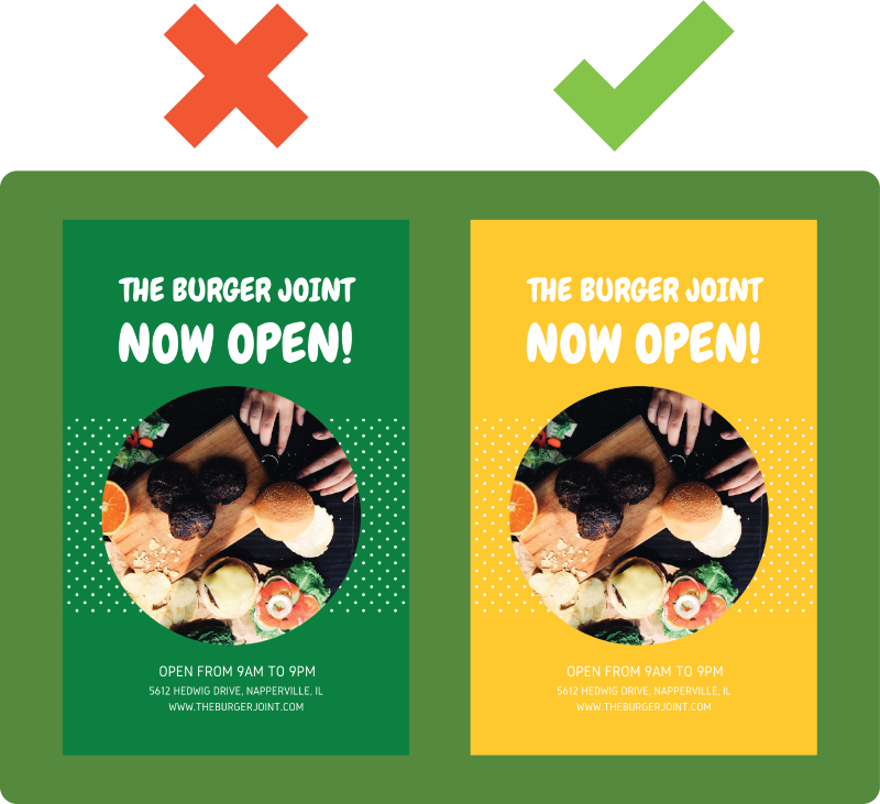
Where you place your sign should have a lot of influence on your restaurant sign design.
If you're placing your sign indoors, and the lighting in your restaurant is relatively dim, you’ll want to make sure your sign has colors that can be seen with ease like yellows, whites, and pastels. Or if you’re designing a window decal, make sure the colors within your sign are visible and pop against the glass.
For outdoor signs, you also want to take into consideration the surroundings of where you are placing your sign. For example, if you’re designing a banner or feather flag that will be displayed near bushes or other greenery, you’ll want to choose a contrasting color for your signage like white or red so that it stands out in its surroundings.
2. Keep it Simple
Whether you are designing a menu board, table tent, banner, or poster, you want to keep it simple.
When someone passes by or visits your restaurant, if you have a sign that has paragraphs of your history or how your amazing food is prepared, then your audience isn’t going to take the time to read it.
Your audience is there to either order and eat or decide if they want to grab dinner at your restaurant or elsewhere. So, you need something quick and simple to grab their attention and help guide them to make a fast decision so they can start enjoying their meal.
For example, “you deserve it” with a picture of crab legs, or “fresh pizza only $1 a slice” is going to bring more customers in than 200 words about how your pizza is made.
3. Contrast is Always Key
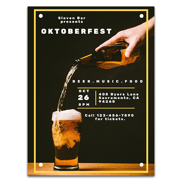
If your sign has high contrast, your customers will be able to read it from a distance, and it will stand out so much more.
A high contrast sign will have light-colored text on a dark background or dark-colored text on a light background.
If choosing a lower in contrast color for your sign design is essential, like a light pink text on a red background, you can add a drop shadow effect to your text to increase the visibility of your sign.
However, if choosing low contrast colors is avoidable, you should always go with high contrast like yellow text on a black background or blue text on a white background.
4. Include High-Quality Images
Images and graphics are so important for any marketing message. And there’s no exception when designing a sign.
The images you choose for your restaurant sign design should enhance the message on your sign. For example, if your sign is promoting your burger special, include an image of a mouthwatering burger that people can’t resist.
You also want to make sure your images are of high quality. This means your images should be at least 300dpi. Also keep in mind that large signs like banners, and menu boards, are typically much larger than a table tent or ceiling dangler meaning the images should be large enough that they don’t appear blurry.
Images in the food and beverage industry are very important, most people take into consideration what something looks like before they take a bite so you may even want to hire a professional photographer.
5. Choose The Right Font
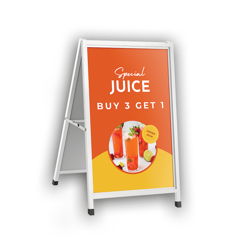
Choosing the right font means choosing a simple and easy to read font.
Your logo may use fancy cursive to promote your timeless style and flavor or another decorative font to promote your fun atmosphere and irresistible snacks. But leave that font for your logo and choose a complimenting, much easier to read font for your messaging.
Sans serif fonts like Verdana or Helvetica are typically the easiest to read at a distance and in general. If a serif font is what works best with your branding, choose one that has the best readability like Georgia or Cambria. For serif fonts keep in mind that you may need to adjust the kerning, or letter spacing, to increase the visibility from a distance for text on menu boards or ceiling danglers.
6. Don’t Forget Negative Space
Clutter in a sign design causes confusion which will turn your customers away. You want to make sure your text, images, and design elements all flow together and create visual balance. And with fluidity and balance comes negative space.
Use negative space or white space to break up design elements and to highlight text. When you have a good amount of negative space it creates breaks for the viewer to better absorb what they are reading.
7. Keep It Consistent
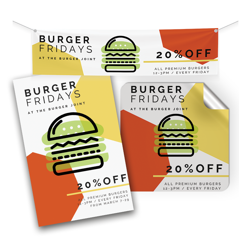
Consistency is so important to build trust, brand awareness, and recognition. Which means if your outdoor signage uses a certain color scheme and font, then your indoor signs should use the same.
If your brand colors are yellow, red, and green then incorporate those colors into your restaurant sign design.
As we mentioned above, if your logo uses a fancy font, you need to choose a complimenting, easy-to-read font for the text in your sign. So, when you choose the perfect font, make it your font for everything. Your menus, table tents, banners, window decals, etc. You can even add this font to your brand guidelines so if you own a franchise, every one of your franchisees knows which font to use.
8. Don’t Forget Your Brand
Consistent branding is key throughout all marketing efforts. And just like using your brand colors in your sign design, you also want to include other branding elements consistently throughout your signage. The more people see your logo, slogan, or other branding elements, the more they will be able to recognize and remember it.
This could include your logo in the corner of your sign, a sign that only displays your logo like a blade sign or a poster that promotes your brand’s slogan. From your large signs, like your entrance sign or menu board, to your smaller signs, like your table tents or ceiling danglers, make sure your signs represent your brand.
Types of Restaurant Signs
1. Menu Boards
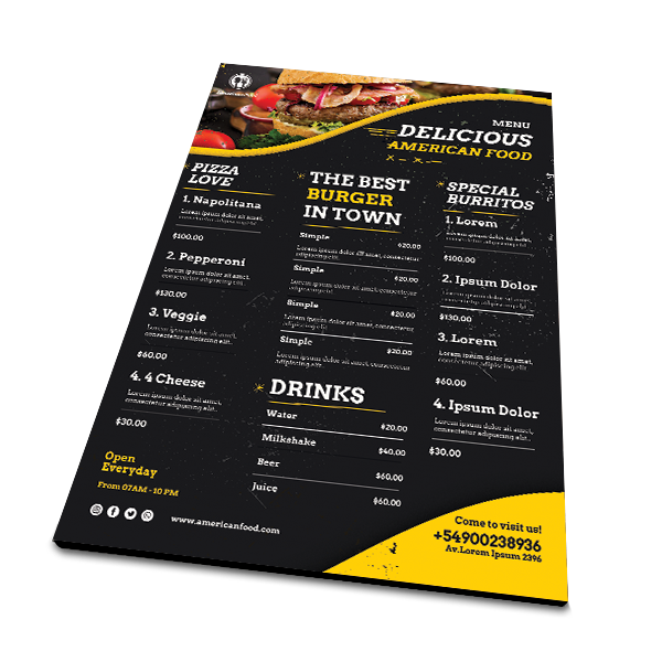
Menu boards come in a variety of sizes, shapes, and materials. Including magnetic menu boards for food trucks, or menus that change seasonally, as well as other options like aluminum, ultrabroad, and PVC for indoor and outdoor use.
If your restaurant operates by people ordering at the front and then taking out or dining in, like a café, food cart, or fast-casual restaurant, then a custom menu board is a necessity. Think about it, when you go to a fast-food chain, if they didn’t have a menu board, you wouldn’t know what to order and would have to ask an employee, which would turn the fast-food experience into quite a long experience.
2. Table Tents
Table tents are popular and extremely affordable restaurant signage that you see on almost every table or bar.
They are perfect for advertising seasonal specials, promoting daily specials, happy hour, or if you use an online menu; they are a great place to include your QR code that directs customers to your digital menu.
3. Banners

Banners placed outside of your restaurant, by the street or entrance, have high visibility. Anyone who passes by will take notice.
That’s what makes custom banners ideal for promoting your restaurant’s message. Not to mention they are extremely durable and affordable as well as versatile. You can hang them up or stand them up using an x-stand or as a retractable banner. You can also stick them in the ground and place them near the road using a feather flag style.
4. Outdoor Signage
Outdoor restaurant signage is a large category that includes any type of sign that can be used outdoors, including window graphics, banners, dimensional lettering, blade signs, entrance signs, logo signs, and more. All of which you should consider using a few to build better brand awareness and to attract more customers.
However, you’ll want to make sure that your restaurant has at least one sign that helps customers know where your restaurant is. This could be a large aluminum sign above your entrance, a backlit sign, or blade sign displaying your restaurant's name and logo. In fact, more than one sign, like dimensional lettering above your entrance and a blade sign that hangs perpendicular to your building can help you bring in even more foot traffic while directing customers to your location with ease.
5. Window Graphics

Custom window graphics, window decals, or window clings used as advertising are a great first impression that attracts customers into your restaurant.
They can include basic information like your hours of operation, contact information, or logo, which are all especially useful if you have limited exterior walls.
Window graphics are also perfect for promoting seasonal options like “it’s oyster season,” to promote your happy hour, or to advertise your daily specials like the beloved “taco Tuesday.”
6. Floor Graphics
Custom floor graphics or floor decals can be used to promote your slogan, highlight your logo, help customers navigate to where they can order, to promote your newest offerings, or to just include an attractive design on the floors of your restaurant.
They are the perfect addition to your restaurant signage and although they are very durable and can withstand long-term foot traffic, they are also easy to remove, allowing you to change them up as you need.
7. Posters
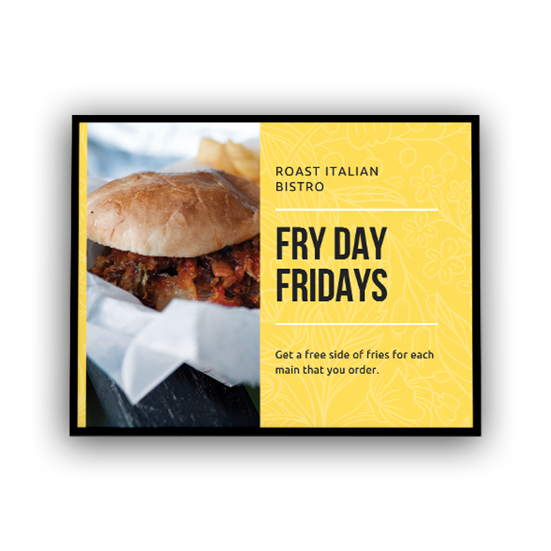
Custom posters are a cheap and effective way to market your restaurant.
Because they are so affordable and easy to design, you can use posters throughout the year to promote anything from seasonal offers, customer rewards, delivery, happy hour, and so much more while changing them out as needed. You could even order a large frame to hang in special places within your restaurant to insert your poster designs as you need. Or you can hang them up at a local venue or other local places to attract customers from afar.
8. Ceiling Danglers
There is no limit to where you can promote your restaurant. From the floor to the walls, and to the ceiling, you can advertise your message everywhere within your restaurant. And ceiling danglers are an affordable way to promote your message from above.
You can place them above your counter to promote an offer, above your bar to promote a signature cocktail, or throughout your restaurant to highlight your restaurant’s values.
Get Started on Your Custom Restaurant Signs
At Conquest Graphics, we specialize in providing effective, affordable, and high-quality products and solutions for your restaurant marketing. Including the options listed above and a variety of other custom signs and wide-format graphics to meet your restaurant's goals and budget.
If you’re interested in custom restaurant signage to successfully promote your brand, click the button below to explore all our sign options, and when you’re ready or if you have any questions, our team of experts are here to help!
Explore More Today!
