A lot goes into designing a calendar, from the month details themselves to incorporating images, messaging, branding, and other design elements. Below are the basics to help you get started on your wall calendar design. For a complete guide on designing a promotional calendar, check out our blog, "How to Design Promotional Calendars with Great Deals and Ideas for Customers."
Select a Theme or Style
What will the theme of your wall calendar be? Will it be related to your industry? For example, a real estate agency might include images of high-profile properties they sold the prior year, or a hair salon might feature stunning styles they can offer. Will your calendar feature customer images? For example, you could host a contest and have your customers send photos of their pets, favorite products they bought from you, or landmarks from where they live for you to include in your calendar. Or are you creating a calendar to promote what you offer or to share information about your company? For example, a retail store could feature products they offer each month, and a nonprofit organization could share information on how they promote their cause.
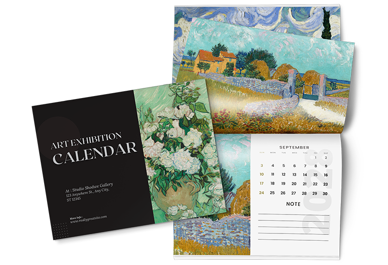
Consider the color and design elements you want to include for the style. Will each month feature colors and design elements that reflect that month? For example, December could have a snowy design, while November includes warm colors and fall leaves. Or will your style align completely with your brand?
Incorporate Images
The images you choose should align with your theme, your brand, and who your audience is. For example, images with people in them should reflect your target audience, including age, gender, and interests. And pictures of your products should align with what you promote that month. For example, a boutique retailer could include bathing suits in July and winter apparel in December. In addition, your images should reflect what your brand offers. For example, a car dealership would include images of cars. In contrast, a lawncare company would have images of lawns and other images that reflect their services. However, remember that depending on your theme, photographs may not align with what you offer. For example, suppose you're hosting a contest for your customers to send photos to be included in your calendar. In that case, your images may not reflect your brand exactly. In this case, it's important to incorporate information and deals revolving around your products and services in the copy of your calendar design and your logo and company name to generate responses and build brand awareness.
Finally, it's essential that your images are high-resolution, at least 300 dpi, and never scaled up more than 20%. This will ensure your photos are printed at the highest quality.
Include Your Branding & Promotions
Whether your wall calendar is for internal or external purposes, it's critical that you include your logo and company name. And not just on the cover of your calendar. Calendars are typically left open on the given month, so you must include branded elements on every page for optimal brand exposure. Even if for internal purposes, like gifting your calendars to employees, by incorporating your branding, you strengthen brand culture. Plus, for some industries like financial providers, every time an employee meets with a client, their client is exposed to your brand when they see your custom wall calendar.
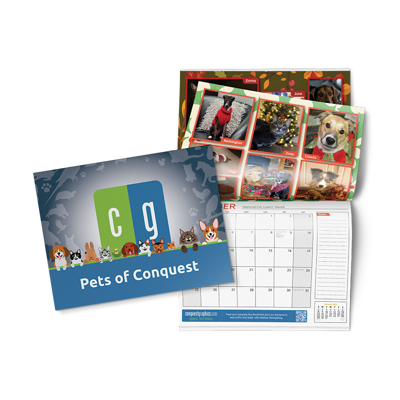
To increase sales using a custom calendar, including promotions and other information on every month's page, is essential to get your audience to take action. For example, a nonprofit organization could promote a charity event with a link to sign up and attend or a note about their good work with a QR code leading to a webpage where people can make a donation.
Select the Right Font Styles & Sizes
Typically, choosing a font style that aligns with your brand is ideal. This helps reinforce your brand's image. After all, your brand is more than just a logo and colors. It's everything that makes your brand what it is, including the typeface you use on your website, communications, and marketing assets. Additionally, you want your font to be easy to read. Ideally, your brand's typeface is already easy to read, but if you decide to stray from your typeface to add a unique touch, avoid any fonts that are hard to read, like curly fonts or ones that are too elaborate.
For the font size, it's essential not to choose a font any smaller than 8pt to avoid your text being difficult to read. Make sure to keep the font size the same for your headlines, month details, main copy, ad copy, and any other sections of text that appear consistently on every page. For example, if your headline for March is 24pt, make sure all other headlines are the same size.
Add Important Dates & Events
When you take advantage of a calendar template, your design already includes the national holidays. However, to customize it for your business, you can also include company anniversaries, employee birthdays, upcoming events your company is hosting or attending, and any other dates important for your brand. For example, healthcare clinics could include essential dates for vaccination reminders and information on health awareness months.
