Every day as we interact with the environment around us our brain translates sensory data into usable information. The smells, the sounds, and the colors we take in help us understand the world around us. Color is one of the most useful pieces of sensory data we take in. The bright orange of a sunrise, the green of the grass, even the black asphalt and yellow lines of the road all help us interpret the world around us. Colors help to shape our daily experiences and are often the reason that we react to certain situations in specific ways.
A great deal of how we perceive and identify brands rely on color. The color a brand chooses affects the way consumers interpret the identity of a company, its intentions, and contribute to its notoriety. So, when you are working on new marketing materials, it is extremely crucial that your colors stay consistent throughout your entire marketing strategy.

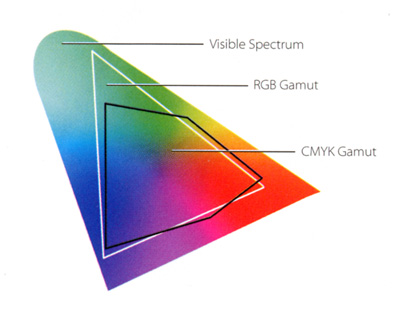
In order to achieve consistent colors throughout all of your marketing channels, you must understand how color works on device screens and on the printed page. Contrary to popular belief, colors are built very differently on screens than they are when printed. Screens are mixing light, print is mixing ink; two extraordinarily different particles are at play, and as such, different color builds and spectrums apply.
Intro to color philosophy
Believe it or not, color is of interest to philosophers for a number of reasons. One of the most significant being the implications that our perception of color can have on the nature of both physical reality and our thoughts. Our visual perception of the world is considered to be one of the most important ways we acquire knowledge, making the understanding of color incredibly important.
Certain colors are known to have specific effects on people’s moods and behaviors which has become a powerful tool for businesses creating marketing materials. For example, blue is associated with health and tranquility, while red can create a sense of urgency and encourage appetite. These effects can drive people to pursue certain products and associate them with a specific feeling that relates to their perception of a color.
When working with a printing company, graphic designer, or anyone else who is molding your brand, communicating how your brand’s colors should be displayed affects the way your marketing is perceived. When choosing colors be sure to investigate the feelings that are most associated with them. Realize that color goes beyond simple hues like red, blue or purple. Color is extraordinarily nuanced, and interpreted by individuals in a myriad of ways. Lighting, screen resolution, paper type, and the color acuity of an individual all play into how colors are seen and interpreted.
Intro to color

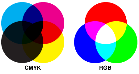
Now that we have covered some of the basic reasons why color is important to everyone’s daily lives, let’s dive into how color is incorporated into the printing process. Color printing is a process used to reproduce images or text in full color, contrary to monochrome printing which only uses black ink. The two major color spectrums that are used to interpret colors are RGB for screen and CMYK for printing.

The RGB color model uses the three primary colors red, green and blue which are added together to produce a range of colors. This is an additive color model where the more color that is used, the closer to white the color becomes. Most often this color model is used on device screens because light particles are being mixed together. RGB needs to be converted into CMYK in order to be used for color printing.

The CMYK color model, also referred to as process color or four color, is a subtractive color model; the more color that is introduced, the closer to black it becomes. CMYK refers to the four inks used in most color printing which are cyan, magenta, yellow and key -- representing black.
The CMYK model separates an image into the four different colors which are transferred to printing plates and run on a four color press. Four color printing consists of numerous overlapping dots of colored ink. Translucent inks are used in this process, allowing each ink to absorb and mix to create any color within the CMYK spectrum. This technique is often referred to as halftone. Process printing gives a printer the ability to simulate all colors in images using the four basic inks. This process has become the universal standard for graphic arts and commercial printing.
Should you use spot colors and the Pantone Matching System?
Spot colors are individual color inks that are pre-made to a very specific formula. The prevalent standard for spot colors and their formulas in the U.S. is the Pantone Matching System, or PMS.
A number of companies that are known for the specific color of their logo or the colors used in their advertising are very likely using a PMS color. This ensures that the color maintains extreme consistency and there is no mistaking the exact color intended to be reproduced.
Using PMS is not cost effective for most small businesses. Spot color inks can be overly costly and implementing them adds several steps to the printing process, thus increasing cost and turnaround time. PMS colors are usually reserved for major multinational brands like Coca-Cola, UPS and IBM who have trademarked a specific color that is crucial to their brand identity, print on a variety of materials, and do business with a number of printing firms.
If you are working with a quality printer they should be able to color match a PMS color using CMYK so closely that you and your customers won’t be able to tell the difference. If you want to be absolutely sure that your colors are exactly right, be sure to request a contract proof so you can see a sample of the printed product. Keep in mind that contract proofs do add an extra cost and increase turnaround time considerably.
Offset vs digital printing
There are multiple printing techniques that are used to produce any variety of materials from business cards to catalogs and even large banners.
Offset printing is a technique where an inked image is transferred -- or offset -- from a metal plate to a rubber blanket and then transferred to the printing surface. Digital printing transfers ink directly onto a surface using some combination of toner, lasers and inks.
The most significant difference between the two methods is that there are no printing plates that need to be replaced with digital printing. For smaller quantities this can reduce costs since plates do not need to be cut and replaced.
In the offset printing process, the plates are replaced multiple times based on the number of colors being used in a job. When printing large quantities this can be useful, allowing for more pages to be printed at a faster rate than digital printing.
When working with a commercial printer be sure to discuss which printing process is best for your job based on the quantity, paper size, and type your job requires. Digital printing is often used for postcards, business cards, flyers and posters. Offset printing is most commonly used for catalogs, brochures, newsletters and jobs that require large quantities.
Considering the subjectivity of color when preparing for printing
When you work with a printer, or even when printing at home, consider how the colors of your artwork will look different on the printed page than they look on your computer. It is important to note that we all see color differently and colors are displayed in a variety of fashions based on the display you're looking at, the paper it’s printed on, the ink it’s printed with and the printing process that is used.
Color is a variable that you should take into account at all times and understand that it can vary depending on the medium through which you’re viewing it. When working with a commercial printer, be sure to set realistic expectations about how your final product will look. Now that you understand the basics of color printing, you can better communicate your expectations and achieve your desired results.
If you have any questions or concerns about color, please give us a call at 800-707-9903 or email customerservice@conquestgraphics.com.


