Brochures are one of the most popular marketing leave behinds for salespeople over a variety of industries.
What Goes into the Design of a Great Leave Behind Brochure?
What makes brochures such a great leave behind is its ability to give your customer detail about your product or service, as well as stunning graphics to grab attention while illustrating and supporting what it is you are trying to convey.
So what makes a brochure stand out from other sales literature? Below are three examples of effective brochure leave-behinds.
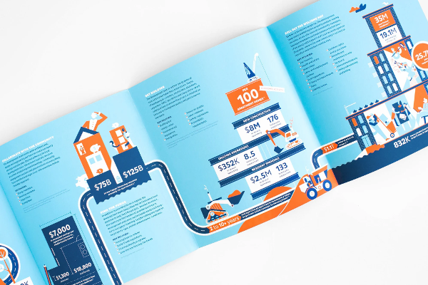
1. An Infographic Leave Behind Brochure
What makes it effective:
a. Infographic Data
This leave-behind brochure is designed for a product or service that relies on data and statistics to communicate the message. Fast facts and infographics are easy for readers to break down, making the benefits of your product clear.
Google Trends data has shown a drastic increase in searches for infographics. This proves that readers opt to visually process information.
b. Bulleted Lists & Clear Headings
Another factor that makes this leave behind brochure effective is through the use of bullet points and headings. This points people to the most vital information and highlights the most important points, making it easier to read and scan.
c. Unique Fold
This leave behind brochure is a gatefold style. Unique folds are appealing to readers, and opening each panel will unlock information about your product or service. This brochure is great for content-heavy material, but make sure the fold you choose works well with the flow of information or it will be awkward to read.

2. A Classic Panel Leave Behind Brochure
What makes it effective:
a. Eye-Catching Graphics
Graphics are a critical part of designing an effective leave behind brochure. Use cleanly designed graphics or professionally edited photos that have a clear focal point and cohesive colors.
b. Distinction Between Panels
As this sample shows, each panel of text is carefully crafted. This makes key points easy to digest. With multiple products or services on a leave behind brochure, section off each by panel with a balanced amount of white space in the margins.

3. A Trifold Leave Behind Brochure
What makes it effective:
a. Design Continuity
This leave behind brochure has great design continuity and flow while maintaining the separation of information. The various color blocks blend well together to create a solid color scheme but content and ideas are well separated for reading.
b. Easy-to-Read Fonts
Choose leave behind brochure fonts carefully! You want to create bold lines and grab the reader’s attention without making reading more difficult, or worse yet, forcing them to miss relevant information. Avoid thin or curvy fonts for this reason.
In a university study on the effects of font sizes and reading it was shown that average font sizes such as ten-point, foster reading and allow the reader to digest the material at a more rapid pace. Alternatively, significantly smaller or larger fonts were shown to slow reading time.
Design and Create a Leave Behind Brochure
Effective design of a leave behind brochure doesn’t have to be difficult. Using some of these leave behind design tips, you too can make yours one they will remember. Be creative, and have some fun selecting graphics, drafting text and choosing fonts and colors.
If you are new to ordering brochures, or you're a seasoned print buyer looking for a designer, we can help. Conquest Graphics offers cost-effective graphic design options. Simply send us your information here, and our graphic design team will be in touch as soon as possible.
 Order Your Leave Behind Brochures Now
