We all know the importance of utilizing the power of printed advertisements. However, when it comes to designing materials, it is important to understand why a good design matters, and how to design effective materials so you can optimize your marketing campaign.
We have previously discussed how to make your print marketing stand out, including everything from choosing the right audience and type face to getting creative with metallic inks and Variable Data personalization. Yet never before have we shared specific tips on some unique ways to design truly effective print marketing materials.
Why Design Matters
Have you ever wondered how important the design of your print marketing is? While also asking: do I really need to spend time on perfecting a “good design”?
The answers: extremely important and absolutely!
The design of anything from print collateral, direct mail materials, website pages, your logo, and anything consisting of design is the first thing that catches your audience's attention.
So, whether it is good or bad, the design of your printed materials is what will determine if your audience is impacted negatively or positively.
Design is the Face of Your Brand
Print marketing, in general, strengthens your brand recognition by reaching out to your audience in a physical and tangible way. However, the design of your printed marketing materials can affect your brand recognition as well.
The design is what represents your business’ message and gives your brand an edge above your competitors. A good design is what makes your brand memorable which is one of the core reasons why the design of your printed marketing materials matter.
Of course, great products and superior customer service plays a role in your customers and prospects remembering your brand. However, certain colors, eye-catching images, and a unique design layout, triggers and stays in the mind of your audience making design just as important.
Because the design of your printed materials is the face of your brand, it is important that your design is consistent across all platforms. This includes the same design style—modern or traditional, realistic images or playful graphics—along with incorporating your logo, company name, and anything else that signifies your brand and lets your audience know that the marketing message they received is from you.
Good Design vs. Bad Design
A well thought out design will grab the viewers' attention while providing information about your brand.
One of the most important things to consider is how your design will relate to your content and how your design will correlate with the printed material itself. After collecting the information that will be included in your print advertisement, you will need to figure out how to build a relationship between the content, your brand, the material and the design.

A bad design has no relationship with the content or brand and is often times unappealing to the eye or confusing. This could include too much text on a small postcard or colors, typeface and images that turn the viewer away or make them question what company the marketing material even came from.
A good design does not overwhelm the viewer and displays the message in a clear and concise way. A good design also includes adequate negative space, consistent branding, high-quality images and content, and an overall layout and style that reels the viewer in.
When creating a good design, everything from the font choice, color, texture of the paper, layout, images, and more need to be thought out carefully. Check out some ways you can make your print marketing stand out and try some of these below tips to enhance your print marketing design.
Tip 1: Remember Your Valuable Brand
We discussed how the design of your marketing materials is the face of your brand, so it's important to include components of your brand. This includes your logo, contact information, website URL, style, and anything else that signifies your brand's identity.
This is especially important when your materials are reaching a new audience. Your design and message will be their first impression of your brand, so you need to keep your brands image in mind so that your audience is able to identify your brand while being able to connect and recognize it in the future.
Tip 2: Get Creative with Copy and Imagery

We’ve talked a lot about clear and concise copy, powerful headlines, strong call-to-actions, and crisp and high-resolution images in our blog about how to make your print marketing stand out. All of this is extremely important in designing effective print advertainments. However, it is important to recognize that there are different ways you can lay your text and images out to make your print marketing stand out even more.
For example, use contrasting fonts to make a big statement, or have an image overflow the border, and remember there aren’t laws within design, you can stretch text and images off of the page and even type on diagonal or curved lines. As long as your message is clear and readable, and not confusing or cluttered, the more creative you get, the more your marketing message stands out from your competitors.
Tip 3: Consider Different Design Techniques

Utilize a Border
Adding a border to your printed materials, like your company's business card design, postcard, or poster creates a frame for your message to stand out and adds a strong visual when your audience views your marketing message.
Whether you go bold and colorful with your border or use a simple and monochrome one, be sure that your border is unified with the overall theme of your design. Another helpful tip is to make sure you use a design template provided by your printer to ensure your border stays within the correct margins and doesn’t lose quality in the print process.
Add Depth and Dimension
Simple and flat print designs, have a powerful place in the marketing world and always will in certain design and brand situations. But adding depth and dimension by adding shadows, or layers can generate an effective outcome.
Try adding text over images, graphic shapes over type, images over colored shapes, etc. The juxtaposition of different design elements, when done in a careful manner, can create stunning print advertisements that your audience won’t be able to ignore.
Keep it Minimal
If your brand conveys a sleek and crisp image, minimalism is the key to your design success. Minimalism is a timeless style that adds harmony with its lack of color and contrasting images.
If your images and text are placed thoughtfully, your minimalist print design creates a visual breath of fresh air that will grab your audience's attention.

Incorporate a Pattern
Negative space is essential for any design. It creates a balance and path for the eye to view the entirety of your printed materials. However, if you feel as though you have gone too far with the negative space, you can fill in the gaps with a unique and visually effective pattern.
There is an endless array of pattern options. For example, you can use a minimal and clean pattern for your business cards or a playful pattern with a bright color palette for your postcards.
Tip 4: Color and Contrast is Everything

Different colors signify different meanings and evoke different emotions. When pairing colors together, include a palette within your design that consists of complementing and contrasting colors. For example, use dark text on light backgrounds and light text on dark backgrounds.
Although colors are very meaningful and can make your printed advertisements pop in an extraordinary way, don’t be afraid to experiment with monochrome colors either. Monochrome colors aren’t always a good fit, but in certain situations, a monochrome design like the front of this black and white newsletter, creates a dramatic and intriguing message that lures the reader in to learn more.
Tip 5: Lay it Out Thoughtfully
It’s easy to throw your headline and image onto your brochure design and then begin to fill in the blank space. However, this is not the way to go about your print marketing design. Designers all over the world follow a key rule: use a grid.
Grids are used during the process of laying out your design content within your design platform like, Adobe InDesign, Illustrator or Microsoft Word to keep the overall design clean and organized. According to Canva, a leader in graphic design platforms, grids help make the design process easier and quicker while helping you to create more attractive designs.
When utilizing a grid, as we discussed in tip #2 don’t be afraid to explore outside of the grid in certain areas either. For example, keep detailed copy of a newsletter distributed and organized cleanly within a grid while stretching and rotating the header to draw the reader in and to create a significant impact.
Tip 6: Seek a Professional
The tips above can help you create stunning marketing materials and print advertisements that are truly effective in generating real results. However, sometimes you need to look to a professional. Luckily, professional graphic designers know these tips and can create amazing designs that match your brands identify and attracts your audience. So, if it's in your budget or if you simply don’t have the time to create designs on your own, it is a good idea to seek a professional.
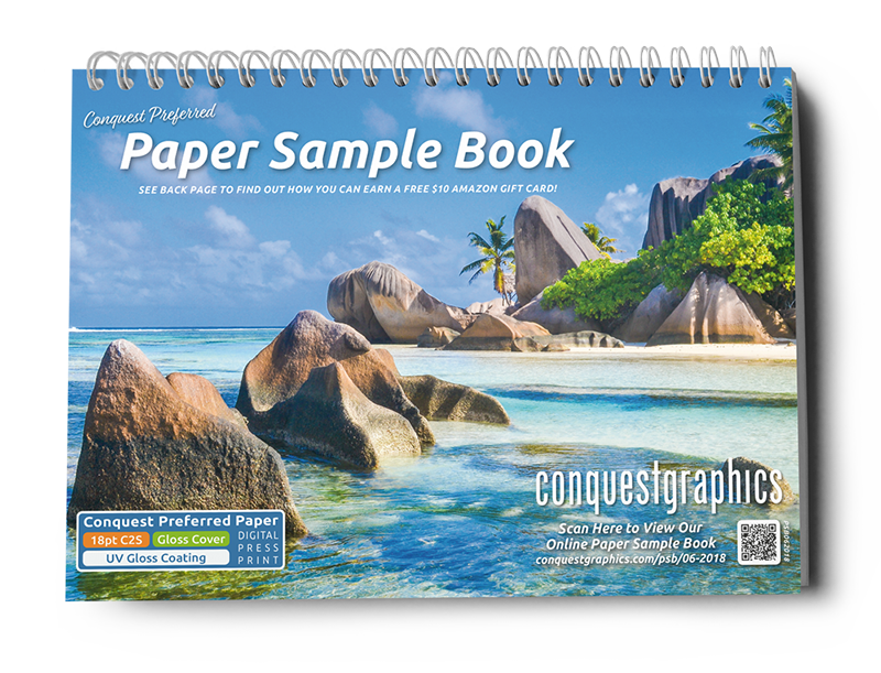
An effective design is sure to leave you with success, so take time to think about the distinctive characteristics of your design and what your overall goal for your design is. Explore some of our other print design related blogs below or click the button to take advantage of our free paper sample booklet to get an idea of different papers available, coatings and other options you have access to when printing with Conquest Graphics.
Get Your Free Resources Today!
