Catalog instant quoting
Get a quote on your next catalog order in seconds.

Catalogs are such an important marketing tool. Not only do they generate a higher response rate compared to email, social media, and paid search ads combined, but they are also preferred by the majority of today’s consumers.
However, to get the most out of your catalog marketing campaign, you’ll need to create an effective catalog design.
With multiple pages it can be easy to get lost in the process which is why we put together some helpful catalog design tips and catalog design inspiration so you can optimize the design of your catalog for better results.
Catalog Design Inspiration + Tips for Designing Effective Catalogs
1. Figure Out the Purpose of Your Catalog
Before you begin designing your catalog, you want to make sure you have a clear idea of what your catalog's purpose is.

There are many different types of catalogs out there including promotional catalogs, informational catalogs, portfolio catalogs, and more.
Depending on the type of catalog you choose, it will help you determine the best layout for your catalog design. For example, product catalogs typically include a lot of imagery, and you can categorize your products while also highlighting your most profitable products with larger images and bold text.
Informational catalogs on the other hand are typically more text heavy which you can keep interesting with design elements that break up your text and provide an easier layout for your audience to engage with.
Once you know the type of catalog you will be designing, create an outline of everything that will be included within your catalog, from the table of contents to the introduction to the final pages. Organizing and laying everything out will help you design each page with ease.
2. Consider Your Audience
Your audience needs to be on the top of your mind even when you’re outlining your catalog content.
You want everything from the colors, flow, energy, message, images etc., to align with the views and feelings of your audience.
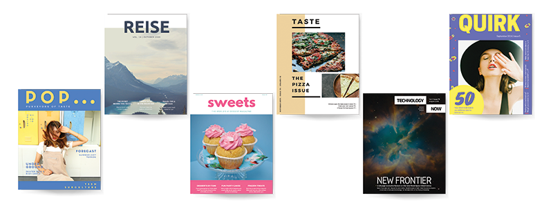
For example, if your audience is successful executives in the financial industry, bright colors, and playful fonts aren’t a good choice. You would instead want to choose a timeless and sophisticated font with a simple color pallet like dark blue and green or even black and white with only a pop of color.
A good rule to follow is to match your design with your brand. This not only helps you with brand consistency, but your brand most likely already aligns with your audience. For example, if you sell organic cosmetics, your logo probably uses an organic style and color pallet to represent its message while attracting an audience who cares about how the products they use are made. So, use those colors, organic shapes, and messaging within your product catalog design.
3. Choose The Right Size and Format
Choosing the right catalog size and format is essential for a successful catalog design.
The average catalog is typically 8.5x11 and the binding is usually stitched in portrait style. This is a good option for catalogs that are meant to be kept forever as they display nicely on a bookshelf or in a magazine rack.
However, depending on the purpose of your catalog, other sizes and binding options can add an advantage to your catalog.
For example, if you’re handing your catalogs out at an event or trade show, you can opt for a smaller catalog like a 5.5x8.5 catalog so it’s easier for your audience to carry around. Or if you’re looking to really make the images within your catalog stand out, you can use a larger catalog like a 9x12 catalog to make a huge impact.
4. Keep Your Design Consistent
One of the most important design tips for designing a successful catalog is consistency.
Consistency within your catalog design refers to two things: make sure it’s consistent with your brand and make sure the pages all consistently flow together.
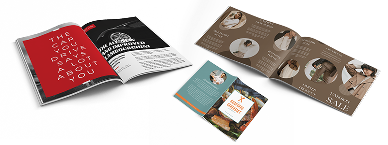
To begin, you want your catalog design to match the style, tone, and message of your brand. This includes using any specific fonts and colors your company uses to identify its brand. For example, on your website, if you use a specific typeface, use that typeface for the copy of your catalog. You can then use bold fonts for headers, or italics to stylize different components within your catalog.
You also want to make sure each page within your catalog works together as one whole.
This means you want each page to have a common denominator like using the same colors on each page. Even if 5 pages are promoting your apparel products and another 5 pages are promoting your home essentials you still want those pages to look like they are from the same catalog.
You can play with colors and add emphasis to certain pages by reversing colors. For example, one page could have a white background with black and yellow font, while another could have a black background with white and yellow font.
5. Know The Importance of Imagery and Image Resolution
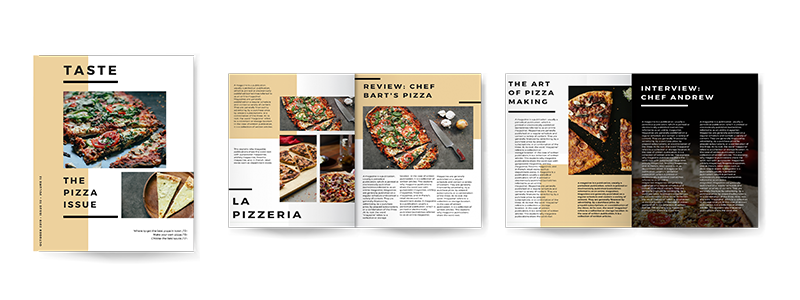
Although some types of catalogs are more image-heavy than others, images are still a particularly important part of your catalog design.
You want to choose images that enhance the copy of your catalog and relate to your audience. You also—which is especially important for product catalogs—want to make sure all images work together.
The best catalogs use consistent, relatable images as well as images of high resolution. This means your images need to be at least 300 DPI in resolution and large enough to not appear blurry when printed. If you don’t have a photographer or high-quality images on hand, it’s a good idea to hire a professional photographer to ensure your images represent your message in a professional and stunning way
6. Don’t Be Afraid to Get Creative
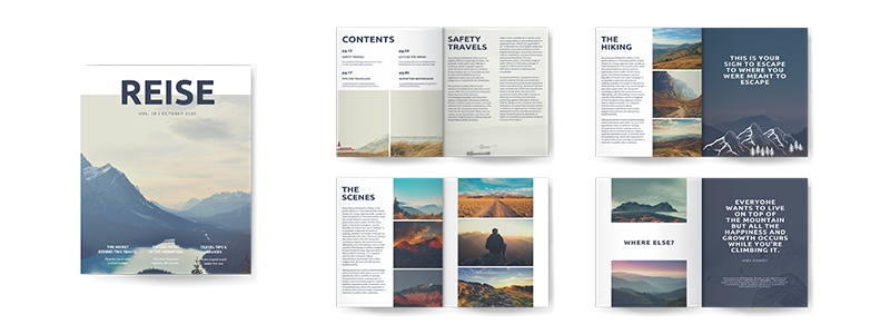
Your catalog should inspire your audience while enticing them to keep flipping from page to page.
To do this, you’ll need a message and images that are relatable and interesting to your specific audience, but you also need to get creative and create a catalog that stands out and shows your audience that your brand is different, it’s the best.
Show your audience through your messaging and design elements, how your products or services are not only the options they want but need.
What makes your brand special? Is it your modern style with affordable prices? Are you a family-owned business that puts the needs of your customers first?
Use borders, shapes, colors, patterns, a velvet or gloss finish that gives your catalog design a fresh and unique style that speaks to your audience and gives value to your brand.
7. But Keep it Organized and Easy to Read
Getting creative with your catalog design is essential, however, you want to make sure to not get carried away.
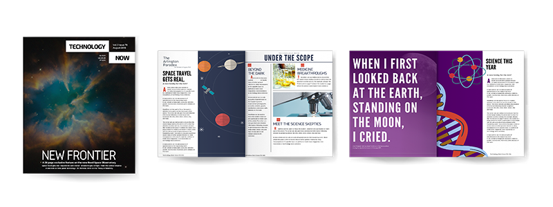
Keep your catalog design organized with enough negative space to break up text and design elements so it’s easy to read and easy for your audience to absorb the information. You don’t want your catalog design to become overwhelming or cluttered.
Once you have a specific theme and color palette, stick with it from the front cover to the back. You want each page to flow together cohesively. You also want to make sure similar items are grouped together. For example, if you own a furniture store, group your living room items together, your bedroom items together, etc., so it’s easy for your audience to navigate to the products they are most interested in.
8. Use a Template to Create the Perfect Layout
Depending on the binding option you choose for your catalog, your catalog pages may need to be divisible by 4 for saddle-stitch or divisible by 2 for perfect binding.
This is important to remember so that you don’t have any blank pages. With multiple pages, it can also be challenging to design each page in the right order. That’s why we always recommend using a catalog design template.
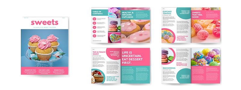
Your printer should have catalog templates available for you. You can even ask them about their complete design template files like the ones below. These templates include complete InDesign sample design packaged files, blank InDesign files, and PDF templates—that can be used in any catalog design software—for the most popular catalog sizes to make designing your catalog even easier.
Take advantage of one of our free catalog design templates below:
9. Choose The Right Paper
Choosing a paper that meets your budget is important, but you also want to make sure to choose a paper that enhances your catalog design.
Typically, we recommend choosing a 100# gloss or velvet text paper for your inside pages and a heavier cover stock like a 100# gloss or velvet cover stock for the cover of your catalog.
Having a thicker, more durable paper for your cover will help your catalog last longer and adds a professional feel to your catalog.
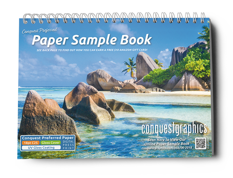
If you’re unsure about what paper to choose for your catalog pages and cover, ask your printer about a free paper sample booklet. They can get one mailed to you so you can see and feel the different paper options before you commit to a specific paper.
Catalog design inspiration can be hard to find when you’re not sure where to begin. But when you start with these catalog design tips you’ll be able to easily create a stunning catalog that generates real results.
For more catalog design inspiration, check out our catalog design blogs below and when you’re ready, click the button to get started on your catalog project!
Get Started on Your Catalog Project Today!
