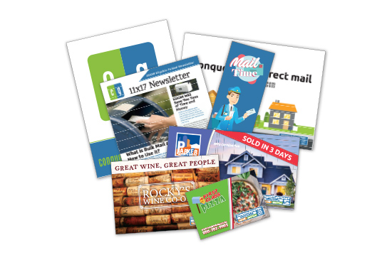
There are many different types of direct mail to choose from including catalogs, postcards, envelopes and letters, brochures, greeting cards, newsletters, and more.
And designing each type of direct mailer has a few differences to consider. For example, when designing your catalog, you need to account for the different pages, and for brochures, you need to take into consideration the type of fold you are designing for.
While there are many design factors that come into play for each different type of direct mail product, there are a few things that never change. And to ensure an effective direct mail design, no matter if you’re designing a postcard or catalog, these direct mail design tips will help you launch a successful direct mail campaign.
1. Know Who Your Audience Is

Direct mail campaigns are typically sent to existing customers or a new audience, and no matter what, you need to make sure your direct mail pieces are designed for your specific target audience.
You need to understand what your audience wants and what they are interested in so you can better design your direct mail pieces in a way that persuades them to take action.
For example, what offers will your audience respond to, what kind of images reflect who they are? What tone and style will they resonate more with?
When you know who you're targeting in your direct mail campaign, you’ll be better able to design an effective direct mail message.
2. Consider the Copy Carefully
The copy within your direct mail design should be clear, concise, tailored to your target audience, and it should be organized well.
Direct the copy to your audiences' interests, for example, if you’re promoting your restaurant, what is important to your audience? Could it be your family friendly atmosphere or your unique and international dishes? Whatever is important to your target audience, from the tone to the actual words, you want to include it within your copy.
You also want to make sure your copy is clear and gets straight to point. You have only a few seconds to grab your audiences’ attention when they first view your direct mail piece, so you want to be careful not to include too much text that may turn the reader away from your message.
Also, even for direct mail products where there are multiple pages that include copy, you want to make sure there is a nice balance between your text, imagery, and other design elements.
3. Use Imagery That Reflects Your Message
Once you know who your audience is, and have the messaging down, you want to choose imagery that reflects both.

For example, if you’re including images of people, choose ones that include people who are around the same age as your audience. If you’re a family-oriented business, targeting families, include an image of a family, or if you’re targeting people with pets, include images of people with their pets.
The imagery you choose to include within your direct mail design, of course, should be of high quality with a resolution of at least 300 dpi to ensure crisp printing of your imagery, but it also needs to reflect your audience and your message. For instance, if a credit union was promoting their auto loan services, they could use an image that has a car in it, while their direct mailer that promotes their low-interest home equity loans could include an image of a family in their home.
This may sound like a no-brainer, but it's so important to remember within your direct mail design because images are often the first thing people notice which means your images need to quickly grab your recipient's attention and attract them to read more. For example, if your audience mostly consists of woman business owners, then if you include images of men, your audience won’t relate to your message as well and may not even realize the message is for them.
4. Negative Space is Key
When it comes to design in general, whether for a sign, a digital add, or direct mail, you always want to include negative space or white space.
This doesn’t mean you need to include the actual color white, rather, you want the background of your design (whether black, red, or blue) to balance and break up the design elements. This will make it easier for your audience to read and absorb the information you are sharing with them.
When there are too many design elements, or not enough space to break up the contents, your direct mail design may come across as busy and overwhelming which will decrease your response rates and your chance at a high ROI.
Also, when you use negative space successfully it can help highlight and bring attention to your most important direct mail design elements. For example, make sure to include a good amount of negative space around your call to action or CTA—like a frame bordering your CTA.
5. High Contrast is Also Key
Just like including negative space, high contrast is a key factor to any good design.

What is the first thing you want your audience to look at? What is the most important part of your direct mail design?
This may include your headline, image, and it will always include your call to action. Whatever it is, you need to use contrast to draw attention to your most important design elements.
This means whatever color you use for your background, you need to choose an opposite color for your design elements. This may include a black background with white text, or a yellow background with dark blue text. Using high contrast in your direct mail design not only drives attention to important information but it also makes your direct mail stand out and makes it easier for your audience to read.
6. Personalize Your Direct Mail Pieces
When you’re designing your mail piece, yes, it’s very important to account for your overall audience, but what about each individual recipient?
When you customize each individual direct mail design to reflect each recipient, you can increase your response rate by 135%.
Plus, it’s easy to do! With Variable Data Printing you can easily and affordably create personalized designs for each individual who is receiving your direct mail piece. This includes names, images, colors, and more so that not only does your direct mail design reflect who your audience and brand is, but it also is personalized for each recipient.
For example, if a winery sends out a postcard to customers offering 20% off wine tastings, they could increase the effectiveness of their direct mail design by including each recipient’s name on each postcard as well as an image of white or red wine depending on the customer’s preference.
7. Stick to Your Brand Guidelines

Brand guidelines are a set of rules and standards that need to be followed to ensure your brand is being represented consistently. And they should be followed throughout all marketing channels, including direct mail.
If your company uses a certain tone, whether playful or serious, or if your brand has a set typeface you use for all printed materials, website content, and digital marketing collateral, then you should use that tone and typeface in your direct mail design as well.
This goes for colors, icons, image formatting, and style as well. The goal is to have all your marketing materials, and other branded content united as one so that it strengthens your brand and so that no matter if someone is looking at your postcard, poster, or display ad, they know it’s you.
Also, don’t forget to include your logo!
8. Use a Direct Mail Design Template
Wherever you are getting your direct mail materials printed, make sure to ask your printer if they have any free design templates for your specific direct mail product.
At Conquest Graphics, we offer a wide range of direct mail design templates that include any direct mail product imaginable as well as various sizes.
These templates will help you layout your direct mail design elements easily within your design platform. They also include guides to ensure you leave enough space for the mailing information and mailing indicia and to make sure you include the proper bleed and margins to ensure your direct mail pieces are printed perfectly.
9. Include a Call to Action Your Audience Can’t Refuse
Your call to action or CTA is the part of your direct mail design that should prompt an immediate response. It should include bold and large text so that it stands out. It should also be clear and short, like “Buy One Get One Free” or “50% Off!”

When you offer something, like a freebie or deal, it makes it hard for your audience to ignore and gives them even more of a reason to take you up on your offer. When you ask your direct mail recipients to sign up for your subscription, or to make a purchase, if you don’t provide them with a discount or other offer, then you’re likely to receive only a few responses. But when you do provide your audience a reason—other than your fantastic products and services—then it intrigues and excites them.
10. Choose an All-in-One Print and Direct Mail Provider
Once you have decided to take advantage of direct mail marketing and have put together the perfect direct mail design, you’ll need to choose a printer and direct mail provider or choose to mail them out yourself.
However, you can save a lot of time and money if you choose a printer who also specializes in direct mail. This is because everything is done in one place. Your printer produces your direct mail materials, and they will prepare and mail them out from within their in-house mailing center.
This means you don’t need to worry about running to the post office or worry about whether or not your materials will arrive in time for you to mail them out.
At Conquest Graphics, we handle everything from beginning to end including helping you plan, printing your project, and mailing it out—our graphic design team can even handle your direct mail design—so that your direct mail materials arrive on time every time. We also have been providing print and mailing services for over 100 years and we will make sure that your direct mail materials are produced professionally and beautifully as well as work with you to ensure you’re getting the best options for your goals and budget.
Click the button below to explore all our direct mail marketing solutions to help you get started on planning your direct mail campaign. If you have questions about our products or are interested in getting some free quotes, please don’t hesitate to reach out to us at 800-707-9903 or by chatting in through our live chat tool!
Explore Your Direct Mail Options Today! Explore Your Direct Mail Options Today!
Check Out Our Popular Direct Mail Products
Contact a Direct Mail Expert Now!
Call 804-591-3352 to get directly in touch with one of our mail experts, any time from 8A - 7P ET.
