When it comes to designing your business sign, the goal is to attract attention from your audience to effectively get the results you are looking for. Yet, there is a lot to consider when building out your sign design including the many components that work together to create a successful business sign and the task can seem challenging.
That’s why we have put together everything you need to know about business sign design so you can confidently get started on designing the perfect sign for your business’s message.
What Do I Need to Consider When Designing My Business Sign?
Before you begin designing an eye-catching business sign there are some key factors that you need to consider first. And by answering the following questions, you can then begin putting your business sign design together successfully.
What is The Purpose of Your Sign?

Knowing the purpose of your sign is an important detail you need to know before designing your business sign.
Are you looking to promote a sale or to attract new customers? Are you looking to build brand awareness or direct your audience to your business’s location?
Who is Your Audience?
If your business sign design isn’t designed for your specific audience, then it won’t work to your advantage.
Who are you looking to attract? What demographic matches your business's current audience? What would your audience be most attracted to? Bright and playful colors, organic shapes and neutral colors, a modern design, or a timeless and sophisticated design?
When you know who your current and intended audience is, you’ll be able to more easily design your business sign effectively.
Where Will Your Sign Be Placed?

Depending on where you are placing your sign will determine the appropriate size of your sign, the size of the design elements within your sign, what you sign’s message reads, and the colors you choose within your business sign design.
For example, if you are placing your sign near a road, your audience is the people who are driving by which means you only have a few seconds to grab their attention. This means you need a large enough sign and text for them to be able to read your sign, a short and clear message so they can absorb the information quickly, and you need to choose colors for your sign that help it stand out in its surroundings.
How Far Away Will Your Audience Be When Reading Your Sign?
This question is in the same realm as the question above, but it’s so important to know where your audience will be when reading your sign. For example, if billboards on the highway were the size of a yard sign, they would be pointless.
Whether your audience will view your sign inside of your store, when they are driving by, when they are sitting at a table in your restaurant, or if your sign is placed around other businesses’ signs, knowing where and how your audience will view your sign will help you choose the right type of sign, the right size of sign, and the right design elements.
How Do I Choose the Right Type of Sign?
Different types of business signs have different purposes and the second step to business sign design is figuring out what needs you need your business sign to fulfill so you can choose the right sign to design. Here are a few examples you may be striving to achieve and some business sign options that work best for each goal:
Promoting a Sale
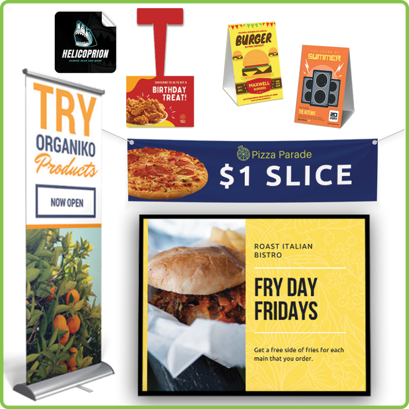
Banners, feather flags, posters, wall decals, yard signs, ceiling danglers, shelf danglers, table tents, and window clings are the perfect business signs to attract your audience to your promotion.
Getting Ready for a Tradeshow or Event
Table tents and table towers, posters, and vinyl banners like x-stand banners and retractable banners are extremely successful at making your tradeshow booth or event stand, stand out.
Promoting Your Brand
Logo signs, dimensional lettering, acrylic signs, car magnets, aluminum signs, blade signs, posters, window decals, backlit signs, and wall decals are all successful at building strong brand awareness and are sure to make your logo, slogan, and other branded elements become more recognizable while attracting your audience to your business.
Directing Your Audience
Yard signs, floor decals, posters, feather flags, banners, and ceiling danglers are effectively used to direct people to a certain destination. For example, real estate agents can use yard signs to direct home buyers to a house for sale, or a retail store can use a ceiling dangler to direct their shoppers to their most profitable products.
How Can I Design a Business Sign That Attracts More Customers?
Now that you have carefully thought out the needs for your business sign design and have chosen the perfect type of sign for your message, you’re ready to begin designing your sign.
Here are a few factors to consider to ensure your business sign design attracts more customers:
Color Choice Has an Impact
First things first, what are the colors of your brand? Do they work with your sign’s message? If so, then use your brand's colors or colors that work well with your brand. Typically, the only time you’d want to steer outside your branding colors is during holidays, and even then, you want to make sure that your logo is at least included within your business sign design to help you build better brand awareness.

Colors also have a big impact on how your audience reacts to your sign. So, if you don’t follow your brand’s exact color pallet, then make sure to choose colors that work well with your branding and colors that evoke the certain feeling you want your audience to feel. For example, red and yellow can encourage appetite while green can promote relaxation.
Make Sure to Create High Contrast
High contrast will make your business sign easier to read and will help it stand out. For example, if you are using a light color text, choose a dark background, or if your logo is a dark color, then you need to choose a light-colored background.
You also want to make sure the overall color has contrast in regards to its location. For example, if you’re placing your banner near greenery, you want to avoid using greens in your sign design, instead choose contrasting colors to make your sign pop in its surroundings.
Use the Right Font and Choose the Right Size
Choosing the right font is incredibly important for getting your message across effectively.
You need to make sure to choose a font that’s easy to read. For example, if interstate signs used cursive, we’d have a lot of lost drivers on the road.
You want your font to be clean, readable, and on-brand. It’s a good idea to choose a standard font that you use throughout your marketing and business materials to achieve brand consistency. For example, if your logo uses a fancy font for its lettering, choose a complimentary, easy to read typeface for messaging, website use, and sign use.
To make certain parts of your sign’s message stand out like the call to action or headline, you’ll want to bold your font and make it larger so that it stands out, is easy to read and grabs the attention of anyone passing by.

Keep Your Business Sign Design Simple
Signs are not meant for long and complex messages. You want your sign's message to be simple and straight to the point.
Create a simple and short message that promotes your message in just a few words. Then choose an image or a few—depending on how large your sign is—that compliments your message. Include a call to action and your logo and that’s it.
Stay away from long informational content and stay focused on what you want your audience to do. If there are elements within your business sign design that don’t need to be there, then remove them.
Choose the Right Material
Choosing the right substrate or material for your sign is extremely important. If your sign is placed outside or anywhere else where there is bright lighting, then a sign with a glossy finish may cause a glare and compromise readability and you’ll need to stick with a matte finish.
However, if you aren’t expecting a glare where you are placing your sign, a glossy finish can make a large image and text standout.
You also need to consider the material of your outdoor signage as certain materials work best outside and will help your business sign design last longer. For example, although coroplast and aluminum are both used for outdoor business signs, aluminum will last much longer while coroplast may last a couple of years or less depending on the weather conditions in your area.
Use Relevant and High-Resolution Images
You need to use high-resolution images, of at least 300dpi. Your sign images also need to be large enough—especially depending on the size of your sign—so they do not appear blurry when printed.
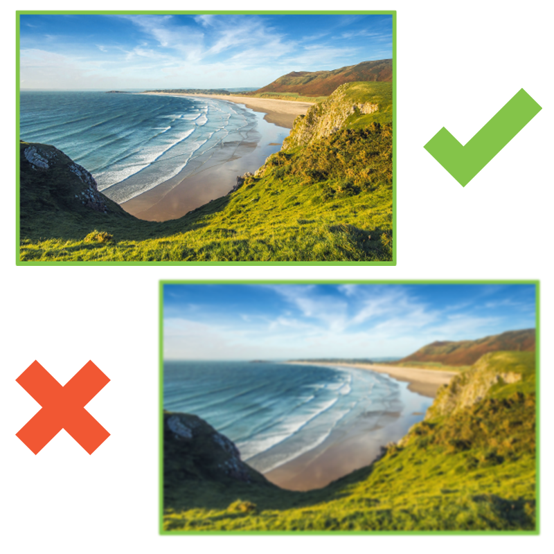
It’s also important to note that you should choose images that reflect your message and relate to your audience. For example, if your restaurant sign design is promoting your $1 slice of pizza then include an image of a delicious slice of pizza.
Now that you know everything there is about business sign design, you’re ready to get started! Click the button below to explore our most popular business sign options and to get started on your business sign project today. We’ve got every option you need to meet your business sign goals and budget and our team of experts are here to help every step of the way.
Explore All Business Signs Here!
